For centuries, colour has been studied to determine how it’s an essential part of how we experience the world, both culturally and physically. Colour has a powerful effect on behavior and the manipulation of colour is used to animate space and invigorate surfaces. It’s a powerful communication took that can be utilized to influence mood, signal action and even influence physiological reactions.
In 1666, Sir Issac Newton, one of the most influential scientists of all time, observed the spectrum of colours through a series of experiments. He was the first to understand the rainbow and how to refract white light with a prism, resolving it into its component colours of red, orange, yellow, green, blue and violet. Artists were amazed with Newton’s discovery on how light alone was responsible for colour. The most useful idea he created for artist was the conceptual arrangement of colours around the circumference of a circle, which became the model colour systems of the 18th and 19th centuries. This eventually brought us to our modern understanding and usage of light and colour. Light can be combined to create and form other colours. The concept of colour psychology has become a big part of the marketing, art, and design language.
Why are colours such a power force in our lives and how does it affect our bodies and mind? There are colour schemes to spark nightmares, red to increase appetite and table turnover in restaurants, black for authority and power, white for serenity and peace, ultraviolet to spur children’s I.Q.’s and more. Understanding the effects of colour is critical in what mood you are trying to get out of your customers.
Colour also affects our bodily functions such as blood pressure, pulse and respiration rates as well as brain activity. Hence, it is also used in medicine for healing.
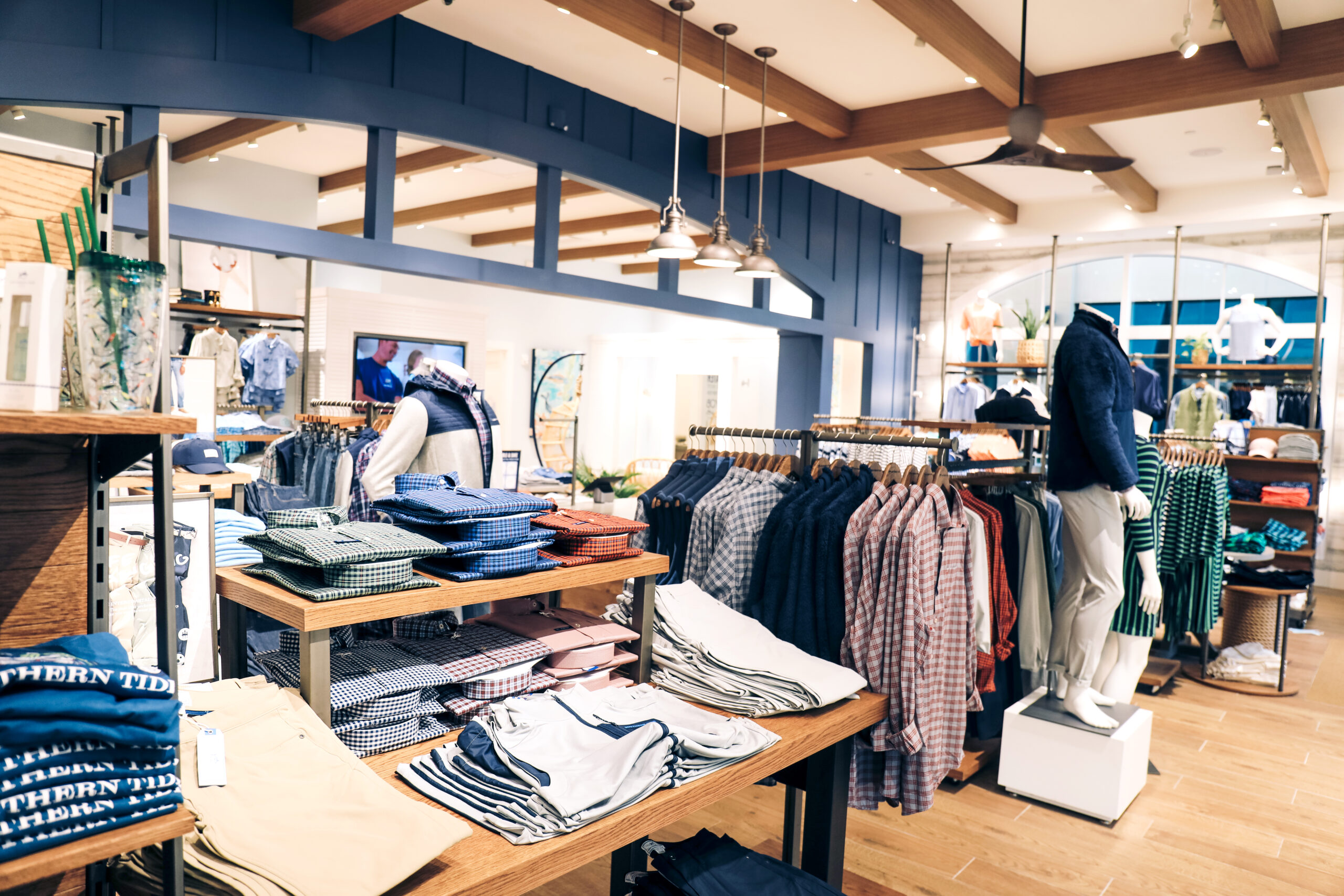
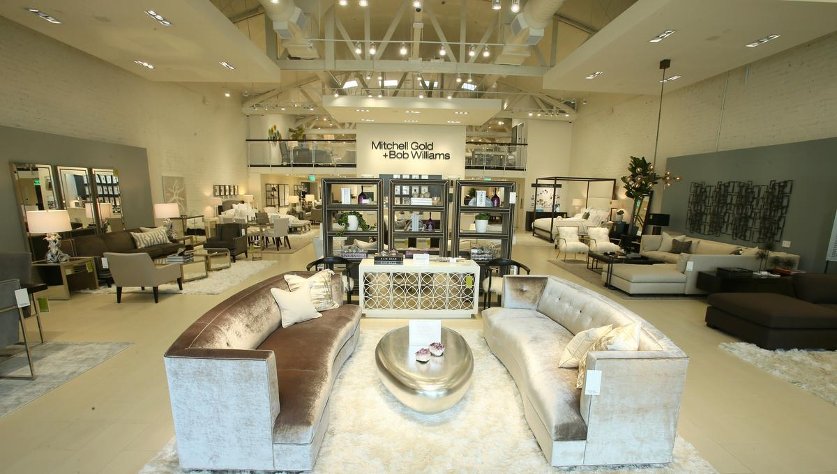
Colour is inescapable, and people all connect to it different. In the world of hospitality, stunning interior design is paramount. Making your hotel stand out from competitors will not only come down to excellent service, but also décor. Therefore, choosing the right colour palette that is most suitable to the style of your hotel is important. The hospitality industry sees a large variety of guests, so incorporating neutral hues into the design scheme will appeal to a wider range of individuals. The beauty of pale and creamy colours is that they all promise tranquility, serenity and luxury.
Let’s dive deeper and take a look at how colour plays a significant role in retail. Statistics from ColourCom stated the following:
- Prospects make a subconscious judgement about a retailer within 90 seconds of entering a store
- 62% – 90% of first impressions are based on colour
- 52% of shoppers won’t return to a store if they don’t like the aesthetics
- 93% of purchasing decisions are on visual appearance
- 85% of customers say colour is the primary reason for purchasing a product
- Adverts in colour are read 42% more often than the same ads in black and white
It’s clear that colour influences customers consciously and subconsciously. It triggers in-store emotions for different genders and types of shoppers. The colour red is used for people to react faster and divert the attention of shoppers to a specific offer such as “sale”. Blue has been used to improve customer loyalty, meanwhile white suggests purity and is well used throughout cosmetic brand packaging. It’s quite fascinating how retail stores and brands utilize the colour palette for specific reactions.
Even in the restaurant industry, colour has a huge role in visual perception, human behavior and emotion. Remember, we eat with our eyes, therefore colour is critical in almost every aspect of a successful restaurant. For example, red stimulates and enhances the appetite, heightening the nerve impulses and heart rate. It is considered one of the most effective and commonly used colours in the food industry. As mentioned earlier, red is such an intense colour it causes a reaction more quickly than any other colour. Since we are making you more aware of the colour, you’ll most likely notice it within restaurants or on logos such as KFC, Coca-Cola, and Heinz.
Within the food industry, blue represents trust and security. It’s used to suppress appetite and reduce hunger which is simply the most unappetizing colour for business. However, it has played a successful gig for healthy “low calorie” foods category. It’s commonly used in seafood restaurants to represent the colour of the ocean, screaming “fresh”. Brands such as Blue Goose and Almond Breeze along with many Greek brands utilize the colour blue to represent healthy, clean foods.